
Website development have to two phases, one is website designing and second is development. Website designing is purely based on front-end user friendly theme. Creating a well-designed website is essential in today's digital age. A successful website goes beyond aesthetics; it's a strategic tool that combines form and function to engage visitors effectively. The design should be visually appealing, with a cohesive color palette, intuitive navigation, and responsive layouts that adapt seamlessly to different devices. Furthermore, user experience is paramount, so it's crucial to optimize load times, minimize clutter, and ensure accessibility for all users. Consistency in branding elements, such as logos and fonts, helps build trust and recognition. Finally, a user-friendly content management system empowers site owners to update and maintain their web presence effortlessly. In sum, website design is about more than just looks; it's about delivering an exceptional user experience and achieving your online goals.
A responsive website adapts to various screen sizes and devices, providing a consistent and user-friendly experience. It ensures that your website looks and functions well on smartphones, tablets, laptops, and desktops. A positive user experience can lead to increased engagement, longer visit durations, and higher conversion rates.
The use of mobile devices, such as smartphones and tablets, has grown significantly in recent years. Many users access websites on mobile devices, so having a responsive design is essential to reach this audience effectively.
Search engines like Google prioritize mobile-friendly websites in their search results. A responsive design can improve your website's search engine ranking, making it more visible to users searching for relevant content or products.
Mobile responsive website design is essential for providing a great user experience, improving SEO, reducing bounce rates, and staying competitive in an increasingly mobile-centric world. It's a fundamental aspect of modern web design and a key consideration for any online presence.
HTML Code Example
All HTML documents must start with a document type declaration: .
The HTML document itself begins with and ends with .
The visible part of the HTML document is between
HTML tag
The HTML
element is used as a container for metadata (data about data). It is used between tag and tag. The head of an HTML document is a part whose content is not displayed in the browser on page loading. It just contains metadata about the HTML document which specifies data about the HTML document.An HTML head can contain lots of metadata information. But head part has a crucial role an HTML document while creating a website.
Metadata defines the document title, character set, styles, links, scripts, and other meta information.
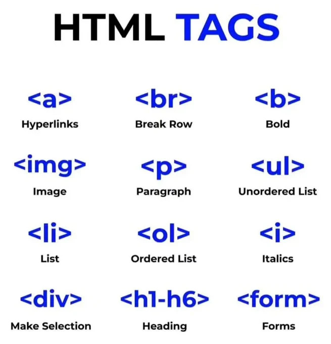
HTML tags
Bootstrap sample code
Bootstrap sample code for practice
Columns in bootstrap
In bootstrap, every row is divided into 12 equal parts. Its provide mobile friendly and all device responsive design framework to manage html them on all devices.
Responsive containers
Responsive containers allow you to specify a class that is 100% wide until the specified breakpoint is reached, after which we apply max-widths for each of the higher breakpoints. For example, .container-sm is 100% wide to start until the sm breakpoint is reached, where it will scale up with md, lg, xl, and xxl.
Fluid containers
In bootstrap use .container-fluid class for a full width container, spanning the entire width of the viewport.
Utilities for layout
For faster mobile-friendly and responsive development, Bootstrap includes dozens of utility classes for showing, hiding, aligning, and spacing content.
Bootstrap is built with flexbox, but not every element’s display has been changed to display: flex as this would add many unnecessary overrides and unexpectedly change key browser behaviors. Most of our components are built with flexbox enabled.
Use the margin and padding spacing utilities to control how elements and components are spaced and sized. Bootstrap includes a six-level scale for spacing utilities, based on a 1rem value default $spacer variable. Choose values for all viewports (e.g., .me-3 for margin-right: 1rem in LTR), or pick responsive variants to target specific viewports (e.g., .me-md-3 for margin-right: 1rem —in LTR— starting at the md breakpoint).
Navbar code of HTML with CSS
Nav tag is used for navigation. Ul, li, achor tags are also used in navbar coding.
Navbar with bootstrap5
Navbars come with built-in support for a handful of sub-components
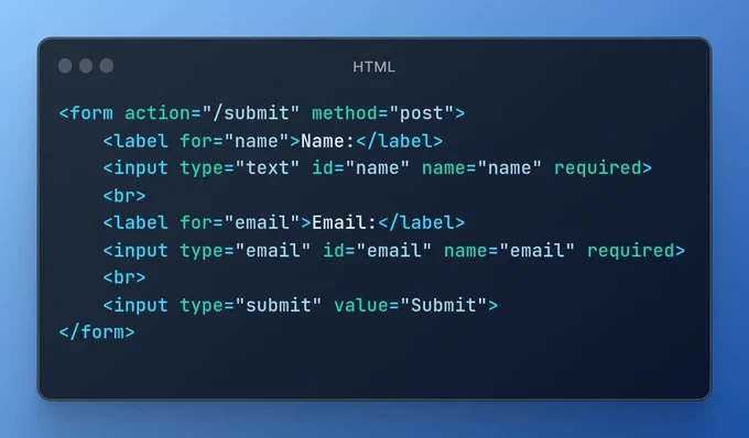
HTML Form sample code
The input from the user is generally sent to a server (Web servers, Mail clients, etc). We use the HTML tag